
Most people who lose money in crypto don’t pick the wrong coin. They pick the wrong moment. They watch a line climbing, feel like they’re missing out, and buy at the exact point where seasoned traders are quietly taking profit and walking away. The gap between a considered decision and an expensive impulse usually comes down to a few minutes spent actually looking at the chart in front of you.
The year 2026 taught that lesson without mercy. Bitcoin had climbed to an all-time high of roughly 126,000 dollars in October 2025, then shed more than half its value by the middle of 2026. Anyone who could read the chart saw the warning signs weeks ahead. Everyone else found out from their account balance.
Learning to read a chart won’t turn you into an investment-bank analyst. It only asks that you recognise enough patterns to decide with a cool head instead of a hot one. The skill builds in sequence. You begin by understanding what a single candle is saying, you learn to read the direction of the trend, you mark the price zones where buyers and sellers have clashed before, and you let volume confirm or contradict what you think you are seeing.
If you are still working out where to place that first position, it is worth seeing how to start trading crypto before you commit real money to a live chart.
A Chart Is a Language, Not a Crystal Ball
A price chart is a visual record of where buyers and sellers agreed to trade, tracked over time. The horizontal axis shows time, the vertical axis shows price, and everything you layer on top of that base exists only to help you read the relationship between the two more clearly.
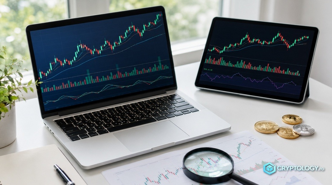
You will mostly meet two formats. The line chart connects closing prices with a single continuous line. It is clean and useful for a quick glance, though it hides the road travelled to reach the final number. The Japanese candlestick chart fills that gap. It was born in eighteenth-century Japan among rice merchants and has since become the standard of modern trading, which is why you will find it set as the default on large exchanges such as Binance and Coinbase and on analysis platforms like TradingView.
The exchange you choose matters too, and there are solid reasons why most traders favour a centralised exchange over a decentralised one when they are just starting out.
Reading a Single Candle
Every candle sums up price movement over a chosen interval and holds four values, the open, the close, the high, and the low, what analysts call OHLC. The thick body shows the distance between the open and the close. Green means price closed higher than it opened, so buyers led the session, while red means sellers had the last word. Your platform may use different colours, but the logic never changes.
Of those four values, the close carries the most weight. Price can jump in every direction while the candle is still forming, yet only the close tells you where the market actually settled. That is why an experienced trader waits for that moment before drawing any conclusion, since a dramatic move at the middle of an interval can evaporate by the time it closes.
The thin lines above and below the body, called wicks or shadows, show how far price travelled before it was pushed back. A long upper wick means buyers were rejected at a higher level. A long lower one means sellers could not hold price down. In crypto, where volatility often explodes overnight, these wicks appear far more often than on traditional markets, and they are early warnings of tension rather than simple hints of direction.
Much of the framework above draws on the analysis published by Cryptology.ro, the Romanian-language crypto news and analysis outlet, which walks beginners through chart reading one layer at a time and lays out, for newcomers, the best cryptocurrency trading platforms.
Why the Timeframe Changes the Story
A single candle can stand for one minute, one hour, four hours, or a whole day. On a 15-minute chart it covers a quarter of an hour, on a daily chart it sums up a full session of trading. Same asset, completely different windows onto what price is doing.
Short timeframes look tempting because there is more movement, yet a good share of that activity means nothing. The approach that works is called top-down analysis. You start from the daily or four-hour chart for the broad direction, then drop to the hourly only to fine-tune your entry. When the small frame and the big frame disagree, you trust the big one. If Bitcoin is falling on the daily chart, there is no sense hunting for long positions on the 15-minute.
Market Structure Shows Whether a Trend Holds or Breaks
Market structure tells you whether price is heading somewhere or drifting sideways with no aim. A healthy uptrend prints higher highs and higher lows. A downtrend does the exact opposite, with every attempt to recover snuffed out earlier than the one before.
Bitcoin has handed us a living textbook for both. Between 2024 and 2025 it climbed from around 60,000 to nearly 126,000 dollars in a clear run of ascending highs and lows. Then everything turned. By 2026, with price trading under all of its major moving averages and posting lower highs, the structure had flipped to bearish. Those who read the change correctly stopped looking for buys, while those still clinging to last year’s mindset were the most exposed to the fall that followed.
Plenty of beginners mistake every dip for a reversal. The difference between a normal correction and a genuine reversal shows up precisely in the structure. As long as the lows keep rising, the trend is intact, however unpleasant the pullbacks feel along the way.
Support, Resistance, and the Voice of Volume
Support is the price zone where buyers have historically stepped in and halted a fall. Resistance is the zone where sellers took control and stopped a rise. They work almost like a collective memory, places where participants react the same way because they remember old trades. A level tested five times carries more weight than one touched once. These roles can swap, so resistance that breaks with conviction often becomes the new support, while support that gives way turns into resistance.
Volume, the number of units traded in an interval, does not show you direction, but it tells you whether a move has conviction behind it. A breakout backed by heavy volume stands a real chance of being genuine, while one on thin volume is usually a trap. In crypto, where the market never closes, nights and weekends bring thinner liquidity, so an impressive candle that prints at three in the morning on a Sunday says something very different from an identical one in the middle of a busy weekday.
Indicators Help but Never Decide Alone
Once you have a feel for candles, trend, levels, and volume, you can add one or two tools that summarise the maths of what is happening. Most successful traders lean on only two or three, not a screen buried under coloured lines that almost always breeds confusion rather than clarity.
Moving Averages Smooth Out the Noise
A moving average takes the average price over a past stretch and draws it as a line, surfacing the underlying direction when raw price is too jumpy. The two most watched in crypto are the simple averages over 50 and 200 days. When the 50-day crosses above the 200-day, the formation is called a golden cross and reads as bullish momentum. When it drops below, traders speak of a death cross, a sign of weakness. These crossings are not infallible prophecies, yet they are watched by so many participants that they end up moving price anyway.
RSI Measures Intensity, Not Timing
The Relative Strength Index, known as RSI, runs on a scale from 0 to 100. Readings above 70 suggest the asset is overbought, below 30 oversold. Before Bitcoin corrected from 126,000 dollars, RSI was flagging momentum that had run to its peak, and a few months later, in June 2026, it had slipped into oversold territory in the thick of the decline. The indicator has a clear limit, though. An asset can stay overbought for weeks inside a strong trend, so anyone who buys mechanically just because RSI dipped below 30 risks getting caught in a fall that simply does not end.
Writing for the same outlet, Mihai Popa, a crypto analyst and journalist at Cryptology.ro, stresses that indicators earn their keep when they confirm something you already see on the chart, not when you ask them to make the call for you. An oversold RSI sitting in a solid support zone, paired with volume that points to buying, says far more than any of those signals taken on its own.
The Traps Specific to 2026
The 2026 market was defined by what traders came to call the age of false breakouts. Price briefly snaps a resistance level, pulls in the overconfident buyers and the leveraged positions, then turns sharply and catches everyone on the wrong foot. The defence most analysts recommend is a timeframe filter. A breakout on the 15-minute chart is often just noise, while a candle close on the four-hour or daily chart carries far more weight.
A second useful gauge is watching funding rates on derivatives platforms. When those rates climb sharply and price stays glued to a resistance zone, the chart is probably overloaded with long positions and primed for a correction. Knowing how the wider market reports gains matters as well, which is why readers in some regions check how crypto profits are declared to the tax authorities before they trade in size.
Discipline Decides More Than Any Setup
None of the tools above is worth anything without risk management. The traders who came through 2026, when Bitcoin lost more than half its value and altcoins like Solana and XRP fell even harder, were not the ones with the most elaborate setups.
They were the ones who caught the trend early, respected the important levels, and kept their losses in check with a protective stop. Nobody is right every time, and the difference between a sustainable path and a disastrous one lies in how much you lose when you are wrong, not in how much you make when you are right.
There is also a psychological side that few guides discuss honestly. If chart-watching turns into compulsive checking or into revenge trading after a loss, the healthiest move is to step away from the screen. A chart stays a tool, not a measure of your worth as a person. Technical analysis covers only part of the risk anyway, since the market can turn on a single headline or a regulatory shift that no chart anticipates. The steadiest traders pair the basics with reliable sources, the kind that explain what CeDeFi means for the modern market, and a healthy dose of humility.
Reading crypto charts is built through repetition. A demo account, with no real money on the line, gives you room to be wrong at no cost, and with every chart you study, the jumble of red and green bars that once looked like a heart monitor slowly starts to make sense.
FAQ
How do you read a crypto chart as a beginner? Start with the candle type so you can see who controlled the interval, then identify the trend from the sequence of highs and lows, mark the support and resistance zones, and confirm any move with volume. Indicators come last, once those four basics feel natural.
What does a green or red candle mean? A green candle shows that price closed higher than it opened, so buyers dominated, while a red candle shows a close below the open, so sellers dominated. Colours can be changed in your platform settings, but the logic is always the relationship between close and open.
Which timeframe should I use? For context, begin with the daily or four-hour chart, since those give steadier signals. Drop to the hourly or 15-minute chart only to fine-tune your entry, never to argue against the direction shown on the higher timeframe.
What is RSI and how do I use it? RSI measures the speed and size of price moves on a scale from 0 to 100, flagging overbought conditions above 70 and oversold below 30. Use it alongside price structure and volume rather than alone, because an asset can remain overbought or oversold for weeks.
What are support and resistance? Support is a price zone where buyers have historically stepped in and stopped a fall, and resistance is where sellers have stopped a rise. These levels can swap roles, with broken resistance becoming support and broken support becoming resistance.
Can I trade on charts alone? Charts give valuable reference points, but they do not cover every risk. Combine them with position sizing, protective stops, and reliable information sources, because the market can move on news or regulation that no chart predicts.
This piece is adapted and condensed from the original article published on Cryptology.ro. The content is for informational and educational purposes only and is not financial advice. The cryptocurrency market is highly volatile, and trading carries a real risk of losing your invested capital.