Understanding the Psychology Behind Patterns
Mixing patterns in home decor isn’t just a design trick — it’s a way to infuse personality, movement, and depth into your living space. To grasp the art of pattern layering, it helps to first understand how patterns interact with our perception. Certain patterns evoke calm and order, while others bring energy and playfulness.
Stripes, for instance, are often associated with structure and modernity. Florals exude a classic, romantic feel, while geometric designs lend a contemporary and bold aesthetic.
Cultural background also plays a role in how patterns are interpreted. Middle Eastern and Indian interiors celebrate an abundance of ornate motifs, while Scandinavian design favors minimalism and subdued visual texture. Thus, pattern mixing is not merely about aesthetics — it’s a tool to shape ambiance and emotional resonance within a room.
Establishing a Dominant Theme
Before diving into pattern combinations, it’s crucial to define the room’s intended atmosphere. Do you want a cozy bohemian vibe or a sleek contemporary space? Once the theme is clear, you can begin by selecting a dominant pattern. This should be the most eye-catching motif in the room and will often appear on larger surfaces, such as area rugs, wallpaper, or a statement sofa.
The dominant pattern acts as the visual anchor. For example, a large-scale floral rug in muted tones can serve as a base around which smaller patterns in coordinating hues can orbit. A geometric wallpaper in bold black and white can set the stage for more playful, colorful accents in accessories.
Balancing Scale and Proportion
Scale is the cornerstone of successful pattern mixing. A room full of patterns with the same scale — all small or all large — can feel chaotic or monotonous. The key is to incorporate patterns of varying sizes. A general rule of thumb is the “60-30-10” principle: 60% of a dominant pattern, 30% of a secondary pattern, and 10% of an accent pattern.
For instance, a large-scale damask wallpaper could be paired with medium-scale striped curtains and small polka dot cushions. Each layer should differ in scale to allow the eye to move comfortably through the space, providing visual relief and rhythm.
Color Coordination Is Key
No matter how diverse the patterns, color harmony ties everything together. Choose a cohesive color palette before selecting patterns. The simplest method is to pick one or two primary colors and build around them with complementary or analogous tones. Monochromatic schemes can also be incredibly effective, especially when textures and patterns differ.
If your dominant pattern is a navy floral, for instance, you could introduce a gingham print in sky blue and white and perhaps a subtle herringbone in dusty grey. Maintaining a color connection — even a faint one — ensures that different patterns feel like members of the same design family.
Mixing Pattern Types with Intention
Not all patterns are created equal, and knowing how to combine different types can elevate your design from interesting to stunning. A good mix includes at least one organic pattern (florals, botanicals, or abstract swirls) and one structured pattern (stripes, checks, grids). This interplay between soft and rigid forms keeps the room visually dynamic.
Try placing a floral-print armchair next to a sofa with a structured chevron throw. Add in a tribal-print rug or a paisley curtain for a bit of cultural flair. As long as the color story aligns, these diverse motifs can coexist beautifully, creating layers of richness and narrative.
Using Neutrals to Break Visual Tension
When you mix bold patterns, it’s essential to give the eye places to rest. This is where neutrals come in. Solid-colored pieces in cream, beige, grey, or soft pastels provide breathing room and balance. Think of them as punctuation marks in your pattern story.
A plain linen sofa can be the perfect canvas for an assortment of patterned cushions. A solid curtain can frame a patterned wall. Or a neutral rug can ground furniture clad in various prints. These visual pauses prevent the room from feeling overstimulating.
Textures: The Silent Companion to Patterns
Textures often go unnoticed in discussions about pattern mixing, but they are just as important. A velvet damask pillow, a chunky knit throw, and a sleek leather ottoman all bring tactile contrast that enriches the pattern experience. Sometimes, textures can substitute for patterns, particularly in minimalist spaces where you want depth without excessive visual clutter.
Pair a matte ceramic lamp with a shiny silk shade. Combine a jute rug with a velvet-upholstered armchair. These combinations work in tandem with your prints to create a sensorially balanced space.
Transitioning Between Spaces
If you’re mixing patterns across multiple rooms, continuity is key. You don’t want every room to look identical, but you also don’t want a jarring contrast when moving from one to another. Use common elements such as color, motif style, or material to create cohesion.
For example, a blue-and-white color scheme in the living room can be echoed in the kitchen through blue floral tiles or white cabinets with blue-patterned dishware. Similarly, if the living area features a botanical theme, the bedroom could carry a leaf motif in a more subdued form, perhaps through embroidery or wallpaper.
Embracing the Rule-Breaking Moments
While guidelines are helpful, some of the most inspiring spaces come from breaking the rules with purpose. An unexpected pattern clash — like leopard print next to ikat — can be stunning when executed with confidence and anchored in strong color harmony. Interior design should be expressive, and pattern mixing offers a bold canvas for self-expression.
Trust your intuition. If something feels right, it probably is. Don’t be afraid to experiment, rearrange, and refine. The most compelling interiors evolve over time, gathering patterns, textures, and stories along the way.
Shopping Tips and Resources
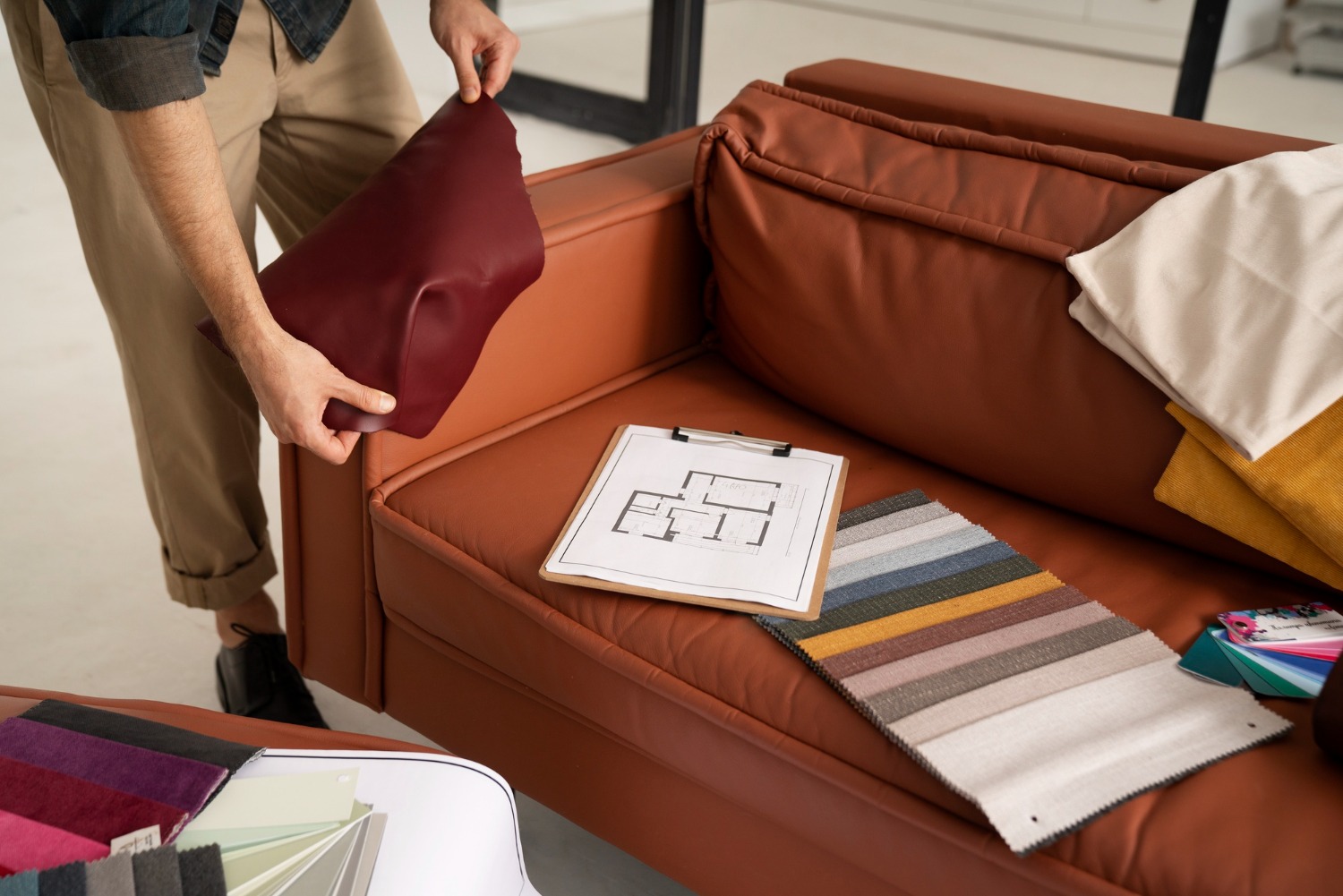
To make the most of your pattern-mixing journey, start by collecting swatches. Many decor retailers offer fabric samples or wallpaper testers. Lay them out together and move them around to see how they interact. Online platforms and home design blogs can also be helpful, especially those with visual boards or interactive planning tools.
A curated online destination for pattern-rich interiors is MGMaison.eu, where inspiration meets practicality in the form of premium textiles, accessories, and decor objects.
Always take your time with big purchases. If possible, test patterns in small doses first — a pillowcase, a lampshade, or a framed fabric panel — before committing to a bold wallpaper or upholstery.
Pattern mixing is more than a decorative strategy — it’s a language. One that speaks through texture, form, and color to tell the story of your home. Whether you’re a maximalist reveling in eclectic joy or a minimalist looking to add subtle depth, learning how to mix patterns is a valuable tool in your design toolkit. Like any language, fluency comes with practice, experimentation, and a willingness to make the space truly your own.